Still Alive
Still Alive came about because of a joke. My sister-in-law Erin Somers had a bit on Twitter, about how there ought to be a magazine about people who you may be surprised to learn are still alive.
These might be older figures, but they could just be people you haven’t thought about for a long time, or perhaps people (or things) that have taken a few rough bounces. It was a simple conceit. In early 2023, Erin, my wife Bailey, their sister Molly, and my friend Paul Brophy set about making it real. Over the next two years, we published three print issues, built the website and the shop, created some fun merch, threw one great party, and published some writing that I still can’t quite believe. (Had you told me that this joke was going to lead to an original Anne Carson poem or connecting with the filmmaker and photographer Michael Galinsky, a personal hero of mine since I bought Half-Cocked, his low-budget road movie from the ’90s, I wouldn’t have believed you.)
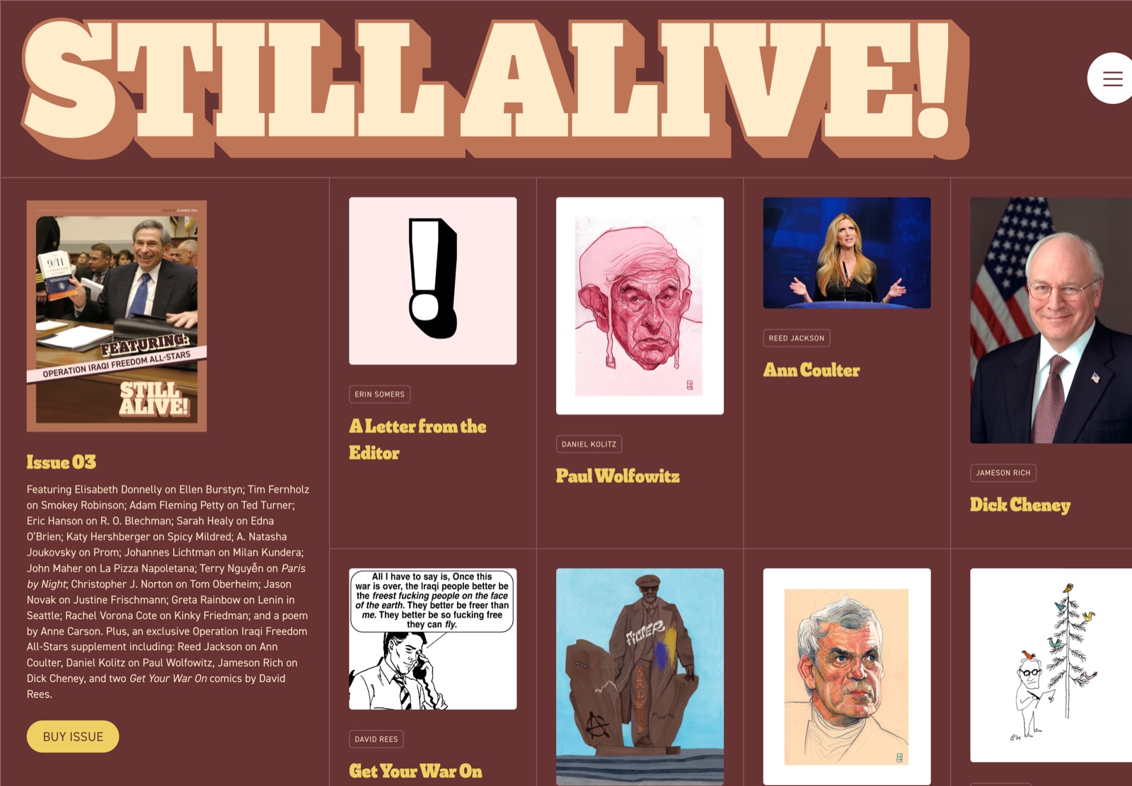
My role was primarily one of the website, and design. I created the initial visual design direction and logo, choosing the slab wordmark (with an exclamation point!) to suggest that even if the magazine was real, our tongues were at least a bit in our cheeks.
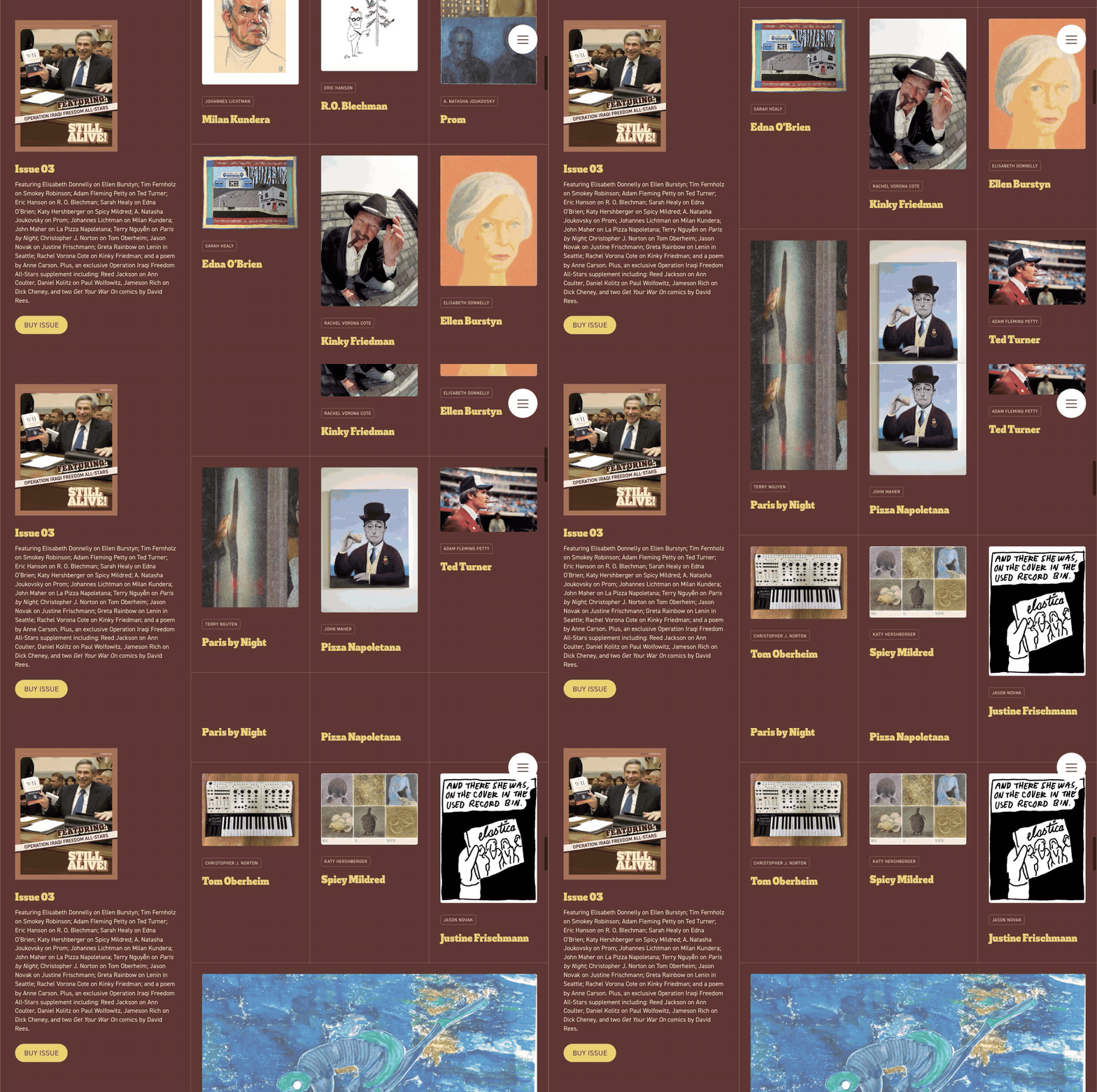
We also worked through a couple of different design directions until we landed on what you’ll see on the site now. It balances the nature of the publication—contributions are grouped as issues, because this was a print-first endeavour—but it’s easy to scroll through everything. We’re clear about what was in each issue, and offered quick links to purchase the issues in our Shopify shop.
It was a blast, and I’m still really fond of what we accomplished.
We collectively decided after the third issue that we were ready for a break: the effort of writing, laying out, printing and distributing was a bit much. (Was it a coincidence that these were the years after Twitter’s sale when it became particularly toxic, and no longer a useful platform to drive traffic to external publications? Probably not.) So we stepped back.
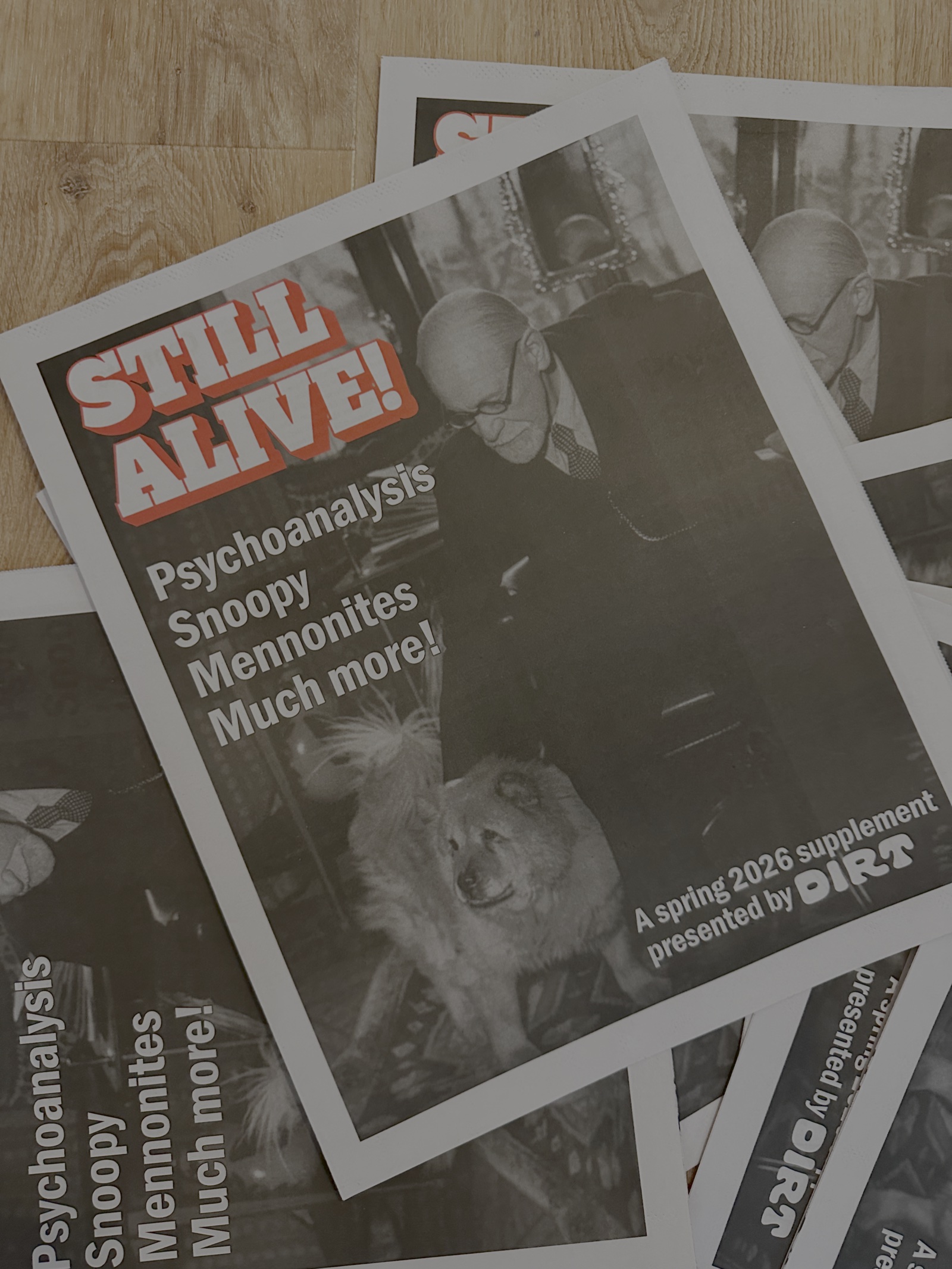
But in the Spring of 2026, there was one more gasp. Still Alive linked up with the platform and publication Dirt to publish a one-off issue with a different, tabloid-newsprint form factor. For this one, I handled all the print layout, and really let the form factor guide the approach. Instead of gloss and color of the three main issues, the spring ‘26 issue took cues from alt weeklies, for both its design and its tone. Funny headlines wouldn’t have made quite as much sense in the main issues, but in a newsprint artifact like this, they fit right in. The issue’s existence was its own kind of joke: this kind of thing is still alive.